Redesigning LMS for 6+ million students

Edtech, Responsive Web Application

Transforming the learning experience, enhancing productivity for teachers and educators, all on a dynamic multi-platform product with millions of avid users

The challenge

When we teamed up with EDRAAK, they already boasted a colossal user base delivering e-learning content across Jordan, Syria, and Egypt. And over the course of our 5-year collaboration, I was the driving force behind their user experience and design enhancements, serving as their go-to partner every step of the way.


Before we teamed up, their work processes were really slow and took up a lot of time. They had trouble developing things efficiently and quickly. The way their platform looked and worked wasn't great, which meant lots of people stopped using it and didn't enjoy it as much.


Learners had a tough time figuring out how to get around the website and found it hard to use the Learning Management System (LMS) to take the courses.

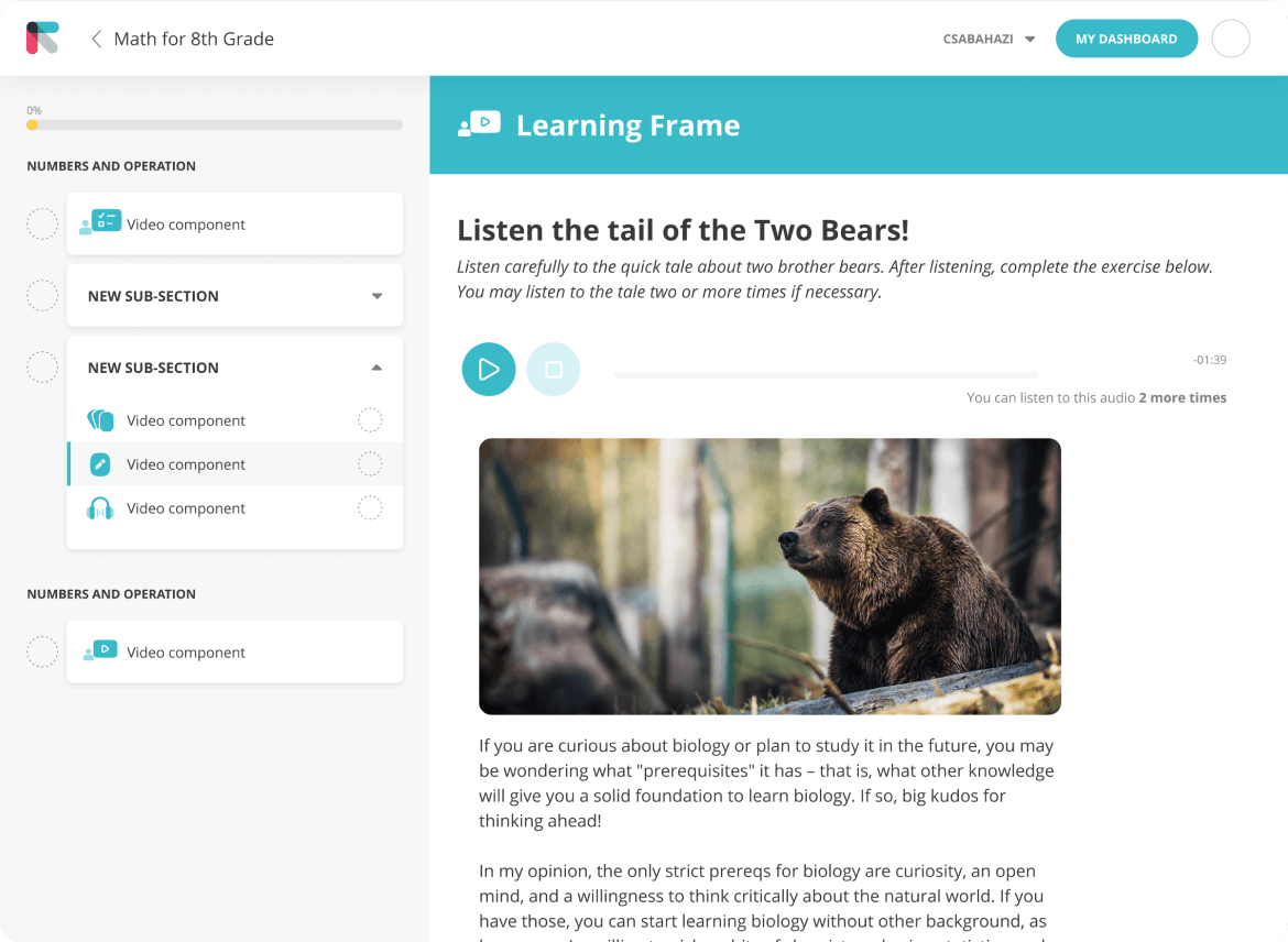
We've worked with several agencies and independent designers, and the result was always less than satisfactory which was unfair to the sort of content we were offering our audience.

Designers always lacked the ability to grasp what we're trying to achieve, and their solutions had no reasoning behind it.

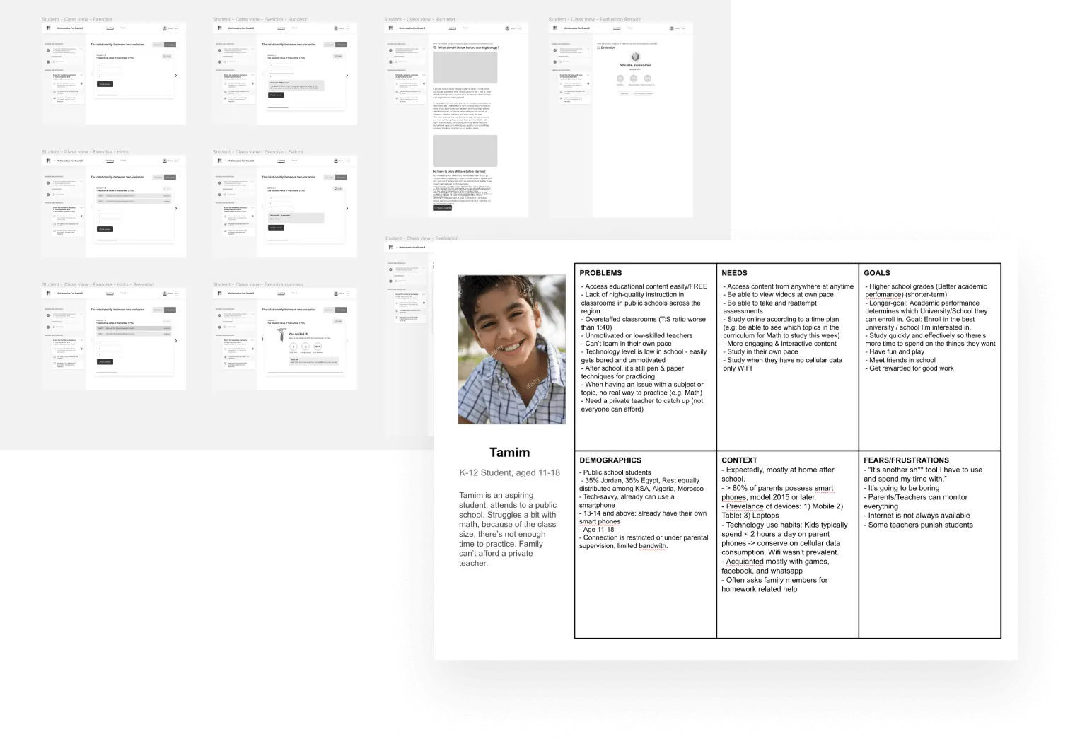
With Csaba present, we were able to provide a unique learning experience that stands up to world standard in ed tech design.
Salah Alomari
Tech lead

Introducing a fun, colorful identity to the brand focused on learning and inclusivity.

Revamped course browsing experience

One of the biggest problems they faced was the poor way the website worked when people searched for courses. This made it hard for people to sign up for courses and understand what courses were available on EDRAAK.


It was really important to create a website that made it easy for people to find courses and areas of study they were interested in, and then start learning right away!

Numerous course platforms tend to clutter their pages with a multitude of course offerings. The challenge arises as more elements are crammed into the design, leading to a competition for attention. However, our research has uncovered that simpler layouts lead to better conversion rates for course sign-ups.

To ensure a thorough and effective process, we conducted a series of workshops with the stakeholders to define the business goals and gain a comprehensive understanding of the domain.


When it came to designing the website, we opted for an iterative approach, employing rapid prototyping techniques with actual content, and testing out 4-5 different versions with real learners in order to create the most seamless and user-friendly experience possible.

Although we offer individual mobile apps, all our products are meticulously designed to be fully accessible on all mobile and tablet devices. This ensures a seamless user experience, irrespective of the platform being used.

Just like with all the other websites we create, we made sure that our designs looked great no matter what kind of screen people were using. That way, everyone can have a great experience whether they're using a computer, a phone, or anything in between!

The course sales page. The most important information are always visible on the right, while students can dig into more information on the left. Clean design and ease to adapt to mobile screens.

Improving the learning experience

Introducing a brand new LMS

The Learning Management System (LMS) is like the beating heart of any educational product. It's where learners spend most of their time interacting with the content and materials. If it's not well-made or user-friendly, it can really hinder a learner's ability to absorb the material and enjoy the learning process. 


Unfortunately, EDRAAK was using an open source LMS called Moodle before, and it just wasn't cutting it. It was hard to use and had a lot of limitations, so we stepped in and created our very own LMS from scratch. Our LMS was designed specifically to provide a more engaging and effective learning experience, so learners could truly thrive.

When building from scratch, the process always needs to begin with researching user needs, becoming familiar with existing solutions, and creating lots of low- and mid-fidelity concept sketches to explore different directions before committing to one.

Key challenges:


The LMS should be easy to use and navigate.
Visual design should be engaging to keep learners interested and engaged.
Navigation between modules and classes should be clear and intuitive.
Interactive elements should be incorporated to make learning more engaging and enjoyable.
The LMS should be compatible and work seamlessly on both desktop and mobile devices.

The newly designed LMS stood the test of time: after millions of users using it for years, it became the standard for the platform replacing all other solutions. 

The main challenge was to design a navigational layout that supports a variety of content types (videos, interactive components). Some courses were simple, consisting of only a few lessons, but others had a vast curriculum and specialized content, which in the previous version resulted in a cluttered interface.


After several rounds of usability testing, we came up with a new version that made it possible for all types of learners to navigate with ease.

This is a good example of how small, thoughtfully animated interactions can elevate the perceived quality of a product and help maintain student motivation. It simply feels good.

Arabic language uses RTL (Right-to-Left) text direction. The typography work is also slightly different, which presents challenges.


We built the design system and every page in a way that there are both English and Arabic versions, which are completely interchangeable. This means developers can easily swap components and pages, moving seamlessly between languages.


This approach has resolved the long-standing, time-consuming process of maintaining multilingual pages.

English on the left, Arabic on the right. With the multilingual design system, it was a piece of cake to translate pages making sure everything looks great with different typography settings. This saved hundreds of working hours at the end.

Simplifying the developer experience

Implementing a multi-lingual design system

A design system is a collection of reusable components, guidelines, and principles that work together to ensure consistency and efficiency in the design and development of digital products or services. It serves as a centralized resource that provides a common language and framework for designers, developers, and other stakeholders involved in the creation and maintenance of a product.

Colors of a design system. Define it once, use it many times. Since Edraak had a wide offering covering B2C and B2B product, the design system as well had to be robust and account for every use case.

We developed a robust and versatile multilingual design system for EDRAAK, encompassing components designed for both business-to-consumer (B2C) and business-to-business (B2B) products across various devices and applications.


The implementation of this extensive design system revolutionized the development process, enabling unprecedented levels of speed and efficiency. Developers were empowered to swiftly introduce new features and add pages, often with the assistance of designers, as the design system ensured a high degree of consistency throughout the entire user interface.

Inputs and buttons in the design system. It's easy to define all the possible interactions, transitions and animations including error states, disabled and loading states which are usually missing from the designs.

FREE GUIDE

7 Profit-draining SaaS UX Mistakes

A must-read guide that uncovers the most common user experience pitfalls that can cripple your SaaS business. Claim your free copy today and start optimizing your SaaS platform for success!

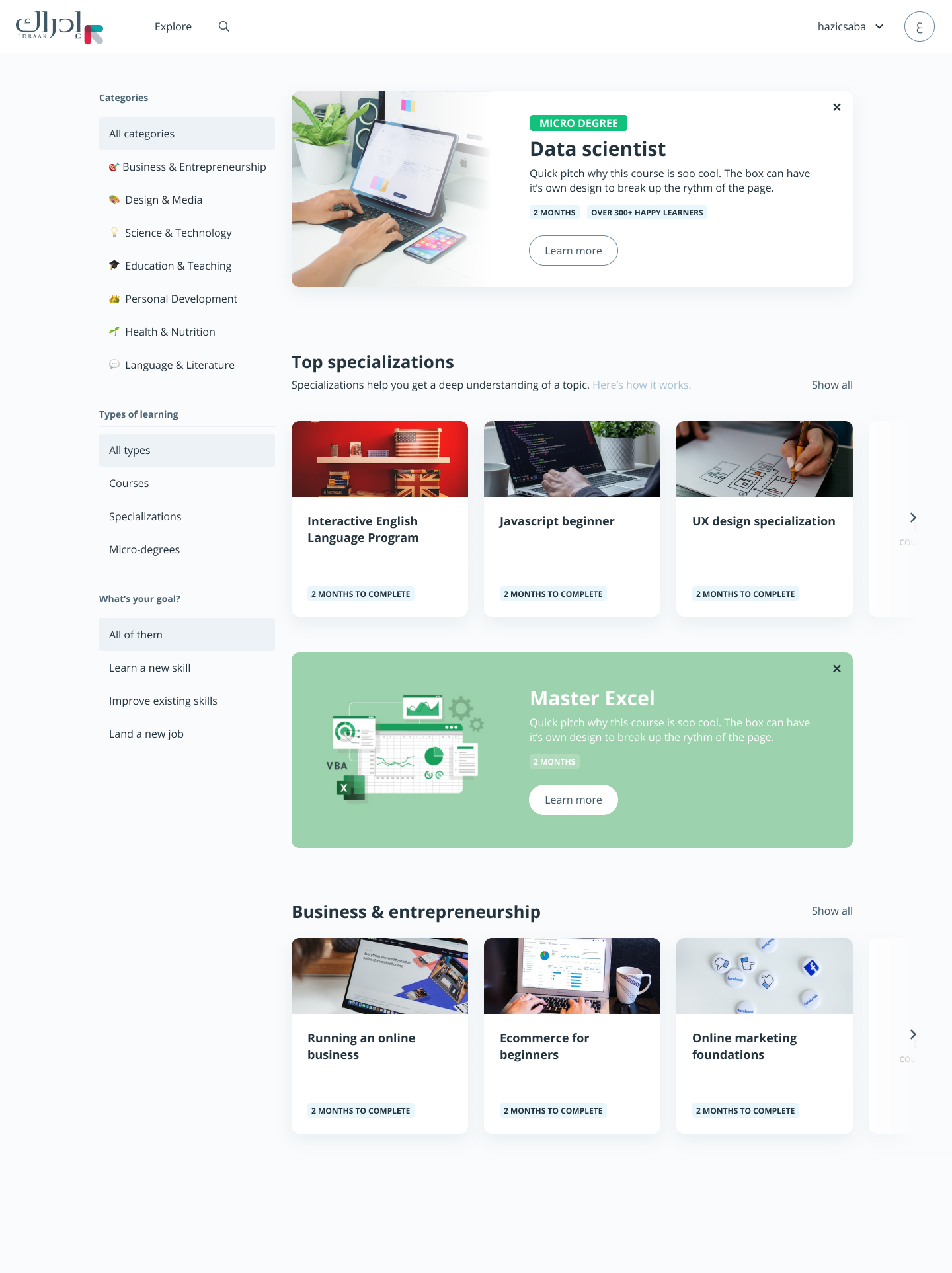
From the first call we had, Csaba demonstrated not only the right skillset but also the right attitude we were looking for.

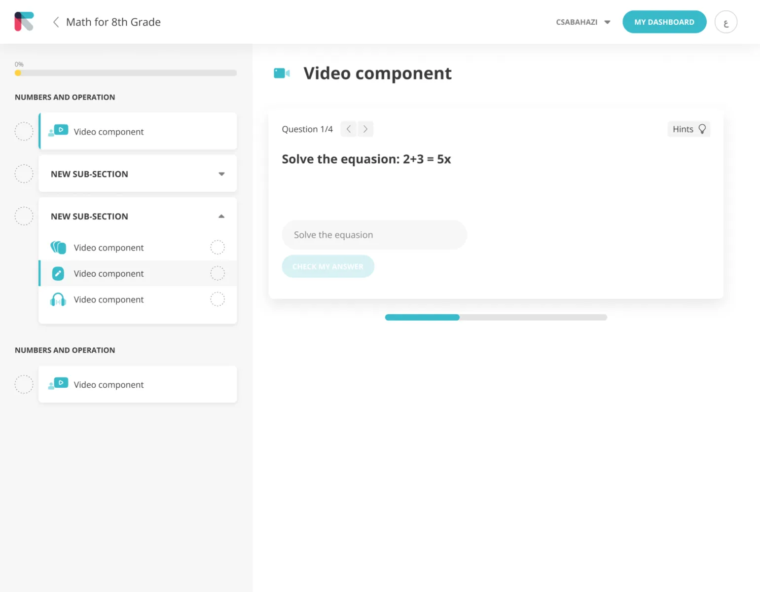
We managed to develop our new UI in a way which is even better our original idea/design. He helped us improve the overall user experience and provided us with multiple options to chose from when seeking to solve a specific problem.
Edoardo Camilli
CEO & Founder
Quickmail had lots of powerful features, but the interface was cluttered and confusing. It was difficult to use certain features which impacted its growth.

Csaba was able to quickly understood our goals and was able to come up with creative solutions that enabled us to improve Quickmail. Thanks to Csaba's work, customers were able to easily use some of the more complex features, resulting in the growth of Quickmail as a company.
Jeremy chatelaine
CEO & Founder @Quickmail.io
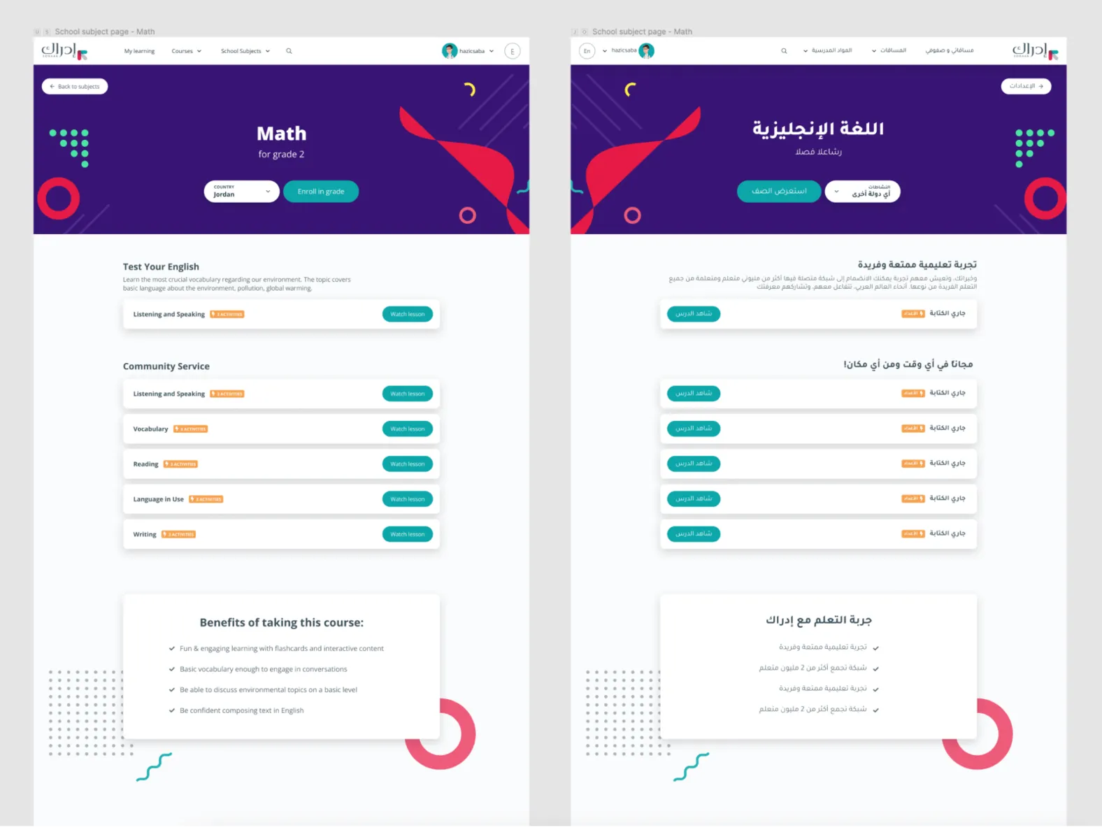
Csaba is the perfect fit for companies with complex SaaS products. He brings structure and order to the UI/UX process, and is able to reconcile entire products under one enjoyable and consistent user experience.

Csaba is that he seeks to understand the user problem and does not take design requests at face value. His approach to balancing between mobile and web designs has saved us on several occasions.
Mohammad Baddar
Senior Product Manager

GET IN TOUCH

Drop me an email at info@csabahazi.com

LEGAL

Terms & Conditions

Cookies Policy

Privacy Policy

FOR STUDENTS

If you have any questions, complaints about our services or products, please visit our support center here:

Your cart is empty Continue
Shopping Cart
Subtotal:
Discount 
Discount 
View Details
- +
Sold Out