Campaign automation for cold emailing

Martech, Responsive Web Application

How we improved the usability of a marketing tool and rolled out a core feature.

The challenge

Quickmail, a cold email automation software, had already built a substantial client base. However, the product's intuitiveness fell short of expectations. Acknowledging this gap, the founder, Jeremy, sought our expertise to enhance the usability of Quickmail, enabling customers to fully harness its potential.


Thanks to our work, Quickmail customers were thrilled with the enhanced user experience. The positive feedback and satisfaction from users propelled Quickmail to a new level of growth, empowering the company to scale and expand its reach in the market.

Csaba was the perfect partner for this project. He quickly understood our goals and was able to come up with creative solutions that enabled us to improve Quickmail. Customers absolutely loved the updates and the tool has grown thanks to his work.
— Jeremy Chatelaine
CEO & Founder

Before

The original product had detached flows, making it difficult to understand how one feature of the tool connects to another. Usually, this is the result of development-first products where only engineers were involved.


While engineers ship the product, it's not their fault if it's not intuitive to use since designing software is not their primary responsibility.

It is challenging to decipher the elements on this screen due to its lack of structure. The layout appears random, and it is unclear what actions we, as users, need to take first and in what sequence.

The screen has multiple layout elements, but they lack a clear and organized arrangement. Certain icons are confusing and don't clearly convey their functions. Moreover, the screen feels overloaded with excessive information, which goes against the principle of simplicity. It's important to guide users and provide clear instructions on what actions they should take while using the screen.

This development-first screen is a prime example where all the features are present, but it feels cluttered and lacks user-friendliness.

Outcomes

During the redesign process, we completely overhauled the navigation system to ensure that the tool is usable by both individual users and agencies or larger organizations.


As part of this effort, we made the decision to merge certain features together, creating a seamless and intuitive workflow that clearly guides users on what actions to take.


The update received positive feedback from Quickmail users, who started utilizing features they had previously overlooked due to a lack of clarity on how to use them.

By introducing a visual interface that allows users to select times and days for scheduling, we created a simple and efficient solution. Users appreciated the straightforwardness of this visual approach, as it replaced the need for multiple forms while achieving the same goal.

Due to the complexity of interactions and multiple screens involved, we employed rapid wireframe prototyping. This allowed us to test various versions and iterate on the flows with users, ensuring that each workflow was refined to perfection.

In the previous design, it was difficult to keep track of a contact's stage. However, in the new design, we made the pipeline visible, which significantly accelerated day-to-day operations.

We added new features, such as the Steps builder, which enabled users to create automated sequences easily.


The key to interfaces like this is to keep the interactions simple and provide ample contextual education. This education helps users understand the different elements and maximize the benefits of automation, as they may not be familiar with it initially.

The steps sequence builder is a powerful feature in Quickmail. We developed this feature from scratch to enable users to create complex flows with ease and efficiency. We incorporated contextual education throughout the process, guiding users on how to build the flows and explaining the purpose of each parameter. As a result, users found it easier to utilize the tool without having to rely on support or tutorial videos.

FREE GUIDE

7 Profit-draining SaaS UX Mistakes

A must-read guide that uncovers the most common user experience pitfalls that can cripple your SaaS business. Claim your free copy today and start optimizing your SaaS platform for success!

From the first call we had, Csaba demonstrated not only the right skillset but also the right attitude we were looking for.

We managed to develop our new UI in a way which is even better our original idea/design. He helped us improve the overall user experience and provided us with multiple options to chose from when seeking to solve a specific problem.
Edoardo Camilli
CEO & Founder
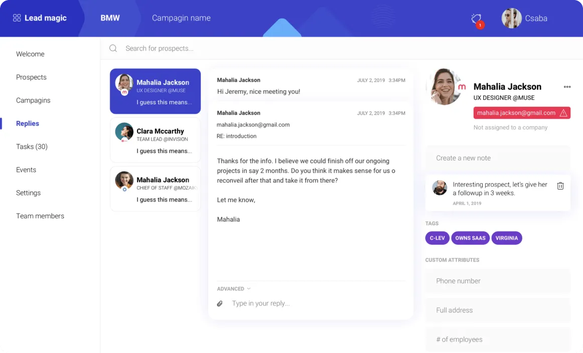
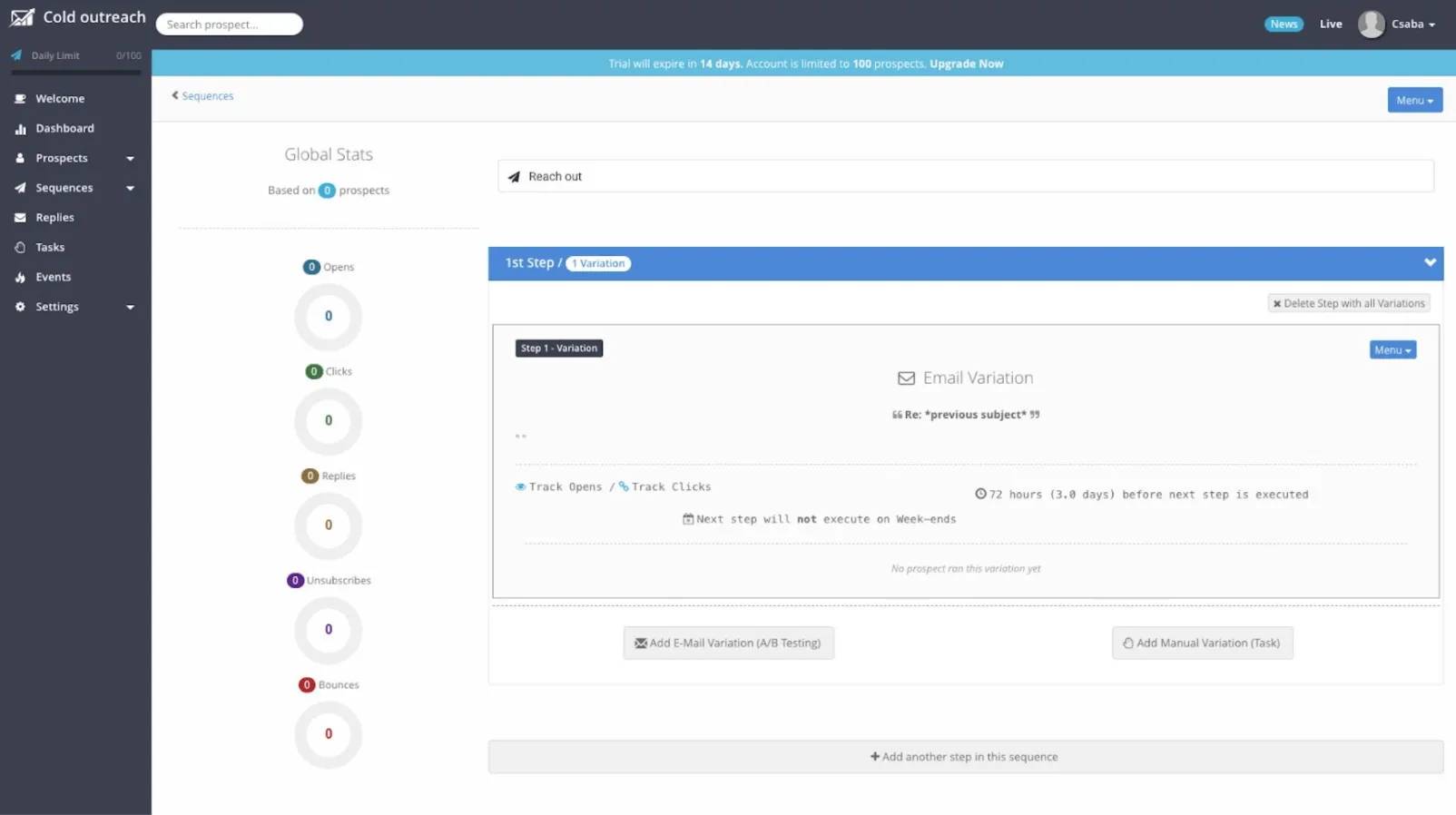
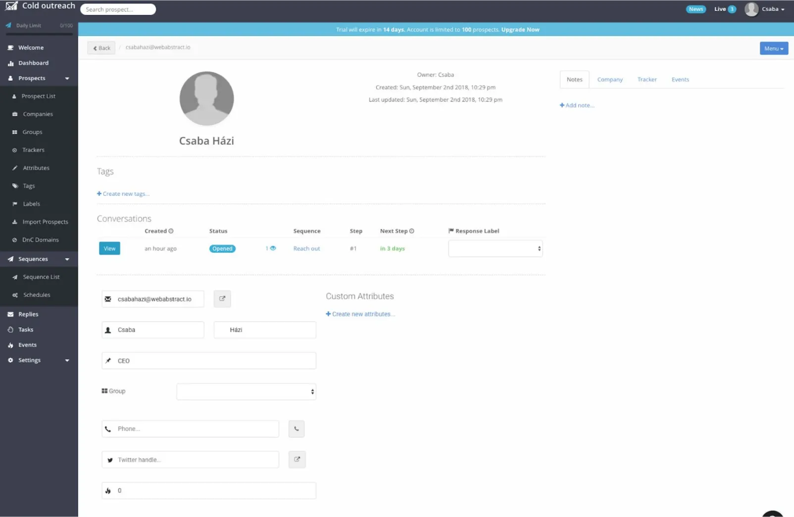
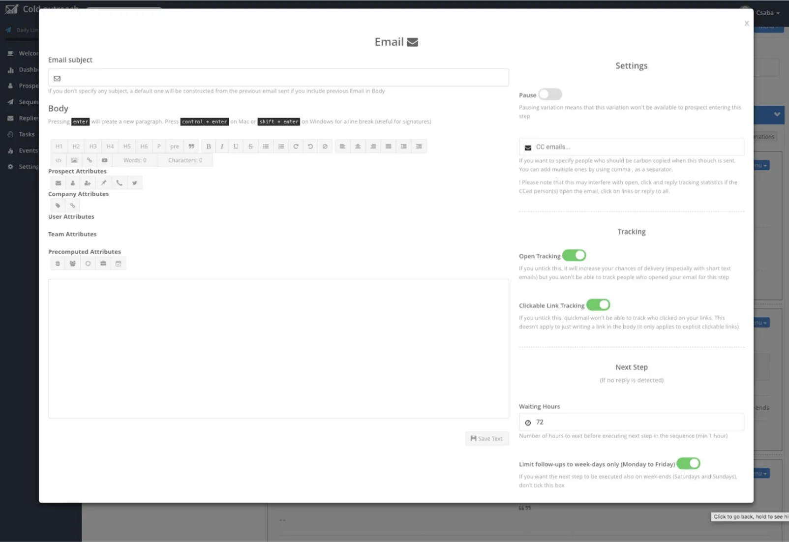
Quickmail had lots of powerful features, but the interface was cluttered and confusing. It was difficult to use certain features which impacted its growth.

Csaba was able to quickly understood our goals and was able to come up with creative solutions that enabled us to improve Quickmail. Thanks to Csaba's work, customers were able to easily use some of the more complex features, resulting in the growth of Quickmail as a company.
Jeremy chatelaine
CEO & Founder @Quickmail.io
Csaba is the perfect fit for companies with complex SaaS products. He brings structure and order to the UI/UX process, and is able to reconcile entire products under one enjoyable and consistent user experience.

Csaba is that he seeks to understand the user problem and does not take design requests at face value. His approach to balancing between mobile and web designs has saved us on several occasions.
Mohammad Baddar
Senior Product Manager

GET IN TOUCH

Drop me an email at info@csabahazi.com

LEGAL

Terms & Conditions

Cookies Policy

Privacy Policy

FOR STUDENTS

If you have any questions, complaints about our services or products, please visit our support center here:

Your cart is empty Continue
Shopping Cart
Subtotal:
Discount 
Discount 
View Details
- +
Sold Out